Tuesday 29 July 2014

BMA243 (snake)

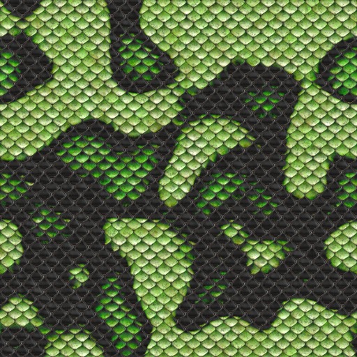
we were taught how to create snakes in illustrator by creating pattern this was a cool lesson though this way left gaps in the joins between each tile. i went online and found a free seamless snake skin texture.


after finding the texture i placed it in photoshop and duplicated the image several times after aligning them and merging the layers i used the puppet warp to modify the shape of the snake and then using the liquefy tool to create the head.


i learnt a few things that will be really helpful to me in the future 

BMA243 Illustration (Pixie)

In class today we were ask to bring a photo of photo of ourselves that had little in the background that we could edit and turn ourselves into pixie like things. this was a fun exercise that took about an hour we worked with the liquefy filter and the surface blur

though the photo was from a cell phone and not very good quality this exercise taught me a few things that i can use in the future

Monday 28 July 2014

BMA242 (Calender hand written notes)

BMA242 (Calender plans Imagery ideas)

this are the images that I am going to choose from to make the calender.

these thumb nails are all images that I have taken.

I will choose 13 out of the 23 images that are here, 1 for the cover and 1 for each month.
though with the portrait images I may place two so that there is not too much white space.

Tuesday 22 July 2014

BMA 243 (Digital Painting)

In this class we had to paint rocks onto a beach.

i sourced the image for this exercise from : http://www.hdwallpaperscool.com/wp-content/uploads/2013/11/beautiful-hd-beach-sunset-wallpapers-top-desktop-images-widescreen.jpgmoeraki boulders


and using the Moeraki Boulders as inspiration had to digitally paint boulders into the image.


this was a fun exercise and i learn a lot about using different tool pre-sets in photoshop using the pack that Scott Robertson released

i went on to do another one of these using a photo that i was give by rachel due to a lack of having my own this exercise even though i am not 100% happy about has taught me quite alot and i enjoyed the process

this is the image that rachel gave to me to use.

and this is the final image after adding in the boulder


BMA 243 (Board Game Research)

Snakes and ladders.

Retrieved from: http://www.foxstone.com.au/snakes_and_ladders.html

this snakes and ladders board is quite small and only has 54 squares including the start and the finish, i do like this as i feel that it is too small however it could be good for quick games.

I am no too keen on the colour scheme or design as it seems to be aimed at young children.


Retrieved from: http://www.fun-free-party-games.com/downloads/Game-Board-Snakes-and-Ladders-Half1.gif

the design is quite interesting though the colours are boring.
much larger with the 100 squares.


Retrieved from: http://www.mintgadgets.com/outdoor-gadgets/the-snake-and-ladders-lawn-game/

this is an interesting spin on the classic snakes and ladders game
the large scale games looks very cool.

Chinese Checkers.

Retrieved from: http://www.fun-free-party-games.com/downloads/Game-Board-Chinese-Checkers-Full.gif

this is a very plain version of Chinese checkers, i was looking at it so that i knew how the board works.


http://www.pinterest.com/pin/85427724154422621/

this is an awesome board with quite a cool design.

drinking snakes and ladders

retrieved from: http://www.boysstuff.co.uk/http://www.boysstuff.co.uk/drinkstuff/snakes-and-ladders-drinking-game/

This is a fun game that i have a copy of at home.


Monday 21 July 2014

BMA 242 - Time line

Here is the final product of the printing timeline that me and Jade worked on together for class.

Time line:


this project was very informative though there are a lot of discrepancies in the dates and who done what when though, the overall information was interesting to learn.

Jade put the video together and i think that it turned out really well.

BMA 242 - Research (How to Create a Professional Magazine Layout)

How to Create a Professional Magazine Layout

by 48 Comments


A few times a each month we revisit some of our reader’s favorite posts from throughout the history of Vectortuts+. This tutorial by Otto Coster was first published on August 4th 2010.
Have you ever wondered how professional designers strike the perfect balance between text and image? Using InDesign's powerful type tools, you will learn techniques to help you set and arrange a magazine layout.
We'll be using a standard A4 size document for this tutorial. Start with setting the number of pages to 8, the bleed to 2 mm so we have some space for images to overlap, the margins to 10 mm for top and bottom, the inside margin to 13 mm and the outside margin to 20 mm. The reason for these different margins is that in a spread with 2 pages a slightly larger margin on the outside of the page looks better and provides space to hold the printed version. It is also useful for the page grid in the next step.
To set up the page grid, go to the "A-master spread" and choose Layout > Create Guides. A grid is used to keep consistency in the page layout and provides a framework for positioning content. A well-used grid is the first thing you need to give your layout a professional look. For this tutorial we're going to use a 12 rows by 12 columns grid with 3 mm spacing. Choose Fit Guides to Margins to create a grid with a column width of 12 mm.
Why? Our page width is 210 mm, with 20 mm outside and 13 mm inside margins we have 177 mm left for 12 columns and 11 gutters. 12 columns of 12 mm plus 11 gutters of 3 mm is 177 mm.
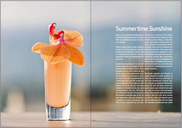
When creating a magazine layout, you'll want to keep a good balance between the white space, images and text. A good technique is to use an image with a lot of 'empty' space, space around the subject has the same function as white space. I'm using a photograph called, Summertime Sunshine by Stewart, it has a nice blurry background that we can place our text on.
Go to page 2–3 and place your photograph in the bleed space so that the entire spread is covered. Move the photograph in the frame so that the subject is within the margin of the first page and the top of the cocktail is at the edge of a grid row.
Make a text frame that is placed at the same vertical and horizontal position as the cocktail on the other page, here in the third row, fifth column of the grid. This creates a imaginary line that connects the image with the text. I've used the title of the photograph, 'Summertime Sunshine' as the heading and filled the rest of the frame with the "Fill with placeholder text" function of InDesign.
To make our text look good we need to set up a baseline grid. Go to the Preferences > Grids and set an Increment Every to 8 pt. In this tutorial we'll be using a text size of 12 pts and a leading of 16 pts. A baseline grid of 8 pts,which is half the leading, provides flexibility because we can also use it for smaller text sizes.
Go tot the paragraph styles palette and change the style of the Basic Paragraph. I've used FF Meta Book Roman with a size of 12 pt and a leading of 16 pt. You can also leave the leading at the auto setting because our baseline grid will make sure all the text is nicely aligned.
Go to Indents and Spacing and set the Alignment to Left Justify. On the web, good looking justified text is almost impossible to achieve, but InDesign makes it very easy to do. Also, change the Align to Grid setting to All Lines, and add 16 pts of space after a paragraph. This is not necessary and you can also use First Line Indent for separating the paragraphs.
Hyphenation is very important for justified text. It breaks up long words at the end of a column so that the column has a straight edge instead of containing a large amount of gaps. The default hyphenation settings in InDesign need some adjusting to improve the look of our body text. I'm changing the settings to use hyphenation only for words with at least 6 letters, and after the first and before the last 3 letters. The hyphen limit sets how many lines in a row can have a hyphen on the end. I think 3 is way too many and a maximum of 1 looks much better. Further, you should disable the checkboxes for Capitalized Words and Last Word.
By default, the justification settings are a bit to loose. Set the word spacing to a minimum of 85% and the maximum to 105%. This way the words don't have large or small gaps between them. For letter spacing, set the minimum to -2% and the maximum to 2%. This improves the justification a lot. You can experiment with glyph scaling as well if needed.
I'm using white as the color for the text because of the dark background. Choose what looks best but keep the text readable.
Open the Text Frame Options with right click on the text frame and change the columns to a number of 2 with a 3 mm gutter. This way the line length is reduced and the readability increases.
For the heading, we want to use a larger text size of 42 pts and a negative tracking value of -50 to decrease the spacing between the letters. Headlines can often benefit from tracking adjustment.
A new function in InDesign CS5 is the possibility for a paragraph to span across columns. We're going to use that here to make the heading span across both the columns of the text frame. Set the Paragraph Layout to Span Columns and Span to All.
Because of the tracking adjustment, the letters "r" and "t" are touching each other now. This is something you want to avoid in general. To solve this I've set the kerning to 75 between the letters which creates enough space to separate them.
Advertisement
The last thing you want to do is a small setting in InDesign's Story palette: Optical Margin Alignment. This pushes the hyphens, quotation marks and wide characters such as the W and A outside the text frame. This increases the look of the edges. Click on the text frame, enable Optical Margin Alignment and set the value to your the size of the body text.
You have now created a simple, but well balanced page with good typography and use of white space. You have the basics set up for a consistent magazine layout.

Retrieved from http://design.tutsplus.com/tutorials/how-to-create-a-professional-magazine-layout--vector-3702


Tuesday 15 July 2014

BMA 243 (Speed Painting About self)

BMA 243 -  Illustration

during class we had to speed paint something to do with our selves I chose to do something to do with magic because it has become something that I am very interested in.

I chose to use the aces from a deck of cards as the imagery in the painting because they are some of the more commonly used cards by magicians and illusionists.

red and blue were chosen because i like these two colours and i thought that they would go well with the theme.

"I am" Speed painting


we were then asked to label the painting in a way that explaining how it related to us.

Labelled "I am" Speed painting

Monday 14 July 2014

BMA 242 (Time Line Project)

BMA242

Timeline Project.

Timeline Information:

618 to 906: T’ang Dynasty used carved wooden blocks and ink make multiple transfers to paper.
868: the Diamond Sutra is printed the earliest dated printed book.
1045: Pi Sheng invents movable type, allowing for characters to be individually placed for printing.
1241: Koreans printed books using moveable type.
1300: China’s first use of wooden type.­
1392: Korea opens foundries that can make bronze type.
1423: Block printing used in Europe to print books
1450: Johann Gensfleisch zum Gutenburg credited with perfecting the system for printing type in books.
1452: Metal plates first used in Europe. Gutenberg Starts printing the Bible.
1456: Gutenberg Finishes printing the Bible.
1457: Fust and Schoeffer make the first colour print.
1460: Albrecht Pfister the first to add illustrations to a printed book.
1465: Germans invent Drypoint engravings.
1470: Nicolas Jenson, considered one of history’s greatest typeface designers, sets news standard for Roman type.
1476: William Caxton begins using a Gutenberg printing press in England
1477: Intaglio is first used for book illustration for a Flemish book called Il Monte Sancto di Dio.
1501: Italic type first used.
1530: Claude Garamond opens first type foundry, developing and selling fonts to printers.
1611: King James Bible published.
1702: Multi-colored engraving invented by German Jakob Le Blon. The first English language daily newspaper is published called the Daily Courant.
1800: Iron printing presses invented.
1819: Rotary printing press invented by Napier.
1829: Embossed printing invented by Louis Braille.
1841: Type-composing machine invented.
1846: Cylinder press invented by Richard Hoe. Cylinder press can print 8,000 sheets an hour.
1863: Rotary web-fed letterpress invented by William Bullock.
1865: Web offset press can print on both sides of paper at once.
1886: Linotype composing machine invented by Ottmar Mergenthaler.
1870: Paper is now mass-manufactured from wood pulp.
1878: Photogravure printing invented by Karl Klic.
1891: Printing presses can now print and fold 90,000 4-page papers an hour. Diazotype invented (print photographs on fabric).
1892: 4-color rotary press invented.
1904: Offset lithography becomes common. The first comic book is published.
1907: Commercial silk screening invented.
1947: Phototypesetting made practical
1645: Post-och Inrikes Tidningar is published in Sweden and is still being published today, making it the world's oldest newspaper.
1704: Considered the world’s first journalist, Daniel Defoe publishs the Review.
1722: First Caslon Old Style font developed, later used for the printing of the Declaration of Independence.
1760: Industrial Revolution begins, setting the stage for advances in graphic design production.
1800: Lord Stanhope invents first printing press made of all cast-iron parts, requiring 1/10 the manual labor and doubling the possible paper size.
1816: First sans-serif font makes a subtle entrance as one line of a book.
1879: The benday process improves newspapers. The first whole page newspaper ad placed by an American department store (John Wanamaker) is run.
1880: First halftone photograph (Shantytown) published in a newspaper. Development of halftone screen allows for first photo printed with a full range of tones.
1890: Art Nouveau movement begins and changes design, making its way into all types of commercial design and utilizing all types of arts.
1917: James Montgomery Flagg designs famous “I Want YOU for the U.S. Army” poster. The poster, a self-portrait, was actually an American version of a British poster by Alfred Leete.
1919: The Bauhaus, a German school, is founded, eventually providing the framework for modern design.
1932: Stanley Morison oversees design of Times New Roman font, commissioned by the Times of London.
1933: A war breaks out between the newspaper and radio industries. American newspapers try to force the Associated Press to terminate news service to radio stations. .
1957: Max Miedinger designs Neue Haas Grotesk font, later renamed Helvetica.
1967: Newspapers use digital production processes and began using computers for operations. .
1969: Douglas Engelbart develops first computer mouse, setting the stage for the future tool of graphic design.
1984: Apple releases first Macintosh computer, featuring bitmap graphics.
1990: Photoshop version one released, and physicist Tim Berners-Lee develops the World Wide Web, along with HTML and the concept of website addresses.
2009: This was the worst year in decades as far as advertising revenues for newspapers. However, newspapers are moving into online internet versions

Information sourced from:

http://inventors.about.com/od/pstartinventions/a/printing_3.htm
http://inventors.about.com/od/pstartinventions/a/printing_4.htm
http://graphicdesign.about.com/od/history/a/timeline1.htm
http://graphicdesign.about.com/od/history/a/timeline2.htm
Introduction

Digital Journal

This blog is for posting work, inspirations and processes that I find during my second semester digital classes.

 BMA242 & BMA243

Advance Digital Edit
Illustration