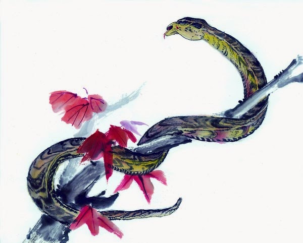
These are the final results of the clock and board game assignment .
Monday, 25 August 2014
Sunday, 24 August 2014
Bma 242 - Reference images
these are the reference images used on the zodiac animals.
images retrieved from the following sites
Zodiac Symbols
Dragon Reference
Snake Reference 1
Snake reference 2
Horse reference
sheep reference
Rooster Reference
Pig and ox reference
tiger reference
Dog reference
Rabbit reference
Rat reference
Monkey reference
BMA 242 - Cover Concepts
here are some of the cover concepts that i have done for the calendar these three are specifically for the front cover.
this on is based on the idea of photos droped and left where the fell, with the sheep on the top because in 2015 it will be the year of the sheep.
this on was done with the idea of a lotus flower in mind with the yin yang symbol being its heart it has all 12 of the zodiacs names in chinese script with the horse on yang and the sheep on yin. to symbolise the passing of the year of the horse to the year of the sheep. the horse is also a yang zodiac where the sheep is a yin zodiac.
this on was ment to symbolise the meeting of and passing on of the new year from the horse to the sheep.
Back Cover
i wanted to keep the back cover nice and simple.
BMA 242 zodiac images
these are the images that were used in my calendar all of them are painted using a reference image
over all i think the images were successful in the own rights.
i am not too happy with this image the dragon didn't quite turn out how i wanted it to. though this was attempt number 6 to do a dragon.
i am really happy with how the horse turned out
the face of the monkey turned out really well i feel
the red and the purple look really good for the ox
the pig looks a bit funny though i still think that it works in a way
the rabbit is probably one of the more successful of the images
the rat is a bit strange and i dont like the feet but i was running out of time.
over all i think the images were successful in the own rights.
Friday, 22 August 2014
BMA 243 - creating a cyborg
found some really cool tutorials on the following websites
http://10steps.sg/tutorials/photoshop/making-of-a-sexy-humanoid/
http://fx.worth1000.com/tutorials/161180/how-i-created-a-cyborgenic-leopard
http://fx.worth1000.com/tutorials/161148/the-making-of-a-robotic-frog
these are some of the cyborg images that i found really interesting

this is the image that David showed us a video on during class it is a very interesting image and looks very good as a cyborg.
retrieved from http://www.advancedphotoshop.co.uk/image/57725/cyborg_mp25

this is a really cool image it is very sci fi
retrieved from http://www.mrwallpaper.com/wallpapers/cyborg-cat.jpg

this image is very cool and has the really clinical/prototype feel to it. i really like this image.
retrieved from http://fc02.deviantart.net/fs71/i/2011/319/b/f/female_cyborg_1st_stage_by_enn_srsbusiness-d4g9bds.jpg
the previous images are more realistic photoshop images though i have got alot of inspiration from games and anime so the following images are from these genres.

this is the nanosuit from the game crysis i really like this and is giving me the idea of a cyber soldier.
retrieved from http://img3.wikia.nocookie.net/__cb20090217202350/crysis/images/2/26/Crysis-US-Nanosuit-1324.jpg
i absolutely love this image i has that very dark element of a cyborg.
retrieved from http://www.wallpaperup.com/220489/cyborg_dark_girl_magic_fantasy_sci-fi.html

this is very cool love the dark angel vibe.
retrieved from http://anime.desktopnexus.com/wallpaper/917215/

this gives me some ideas on how to form the cyborg.
retrieved from http://img3.wikia.nocookie.net/__cb20130208041321/onepunchman/images/6/60/Cyborg_body.png

this is a very cool design and the very brutal cyborg arm looks very savage.
retrieved from http://i704.photobucket.com/albums/ww50/neroreinkest/anime%20guys/sword.jpg
Bma 242 - printing issues
when printing my calendar at McDowell's print, i had issues with printing my pdf because the calendar template that we were given was in american sizings and because i was told by my tutor to use the template and not adjust it, i didnt even think to check the sizes, because of this the calendar turned out to be smaller than i had expected though i didnt have much choice, as it was all the people at McDowell's could to keep it undistorted.
Bma 242 - calendar research
these are a few of the calendars that i looked at to find inspiration for my calendar.

Retrieved from http://www.photocreate.com.au/images/marketing/hires_jpg/11.5x14_calendar_KidsMontage.jpg
i quite like this calendar how it is a few different images though it is quite plain and i don't think this is a style i would like to look into.
the following are a few cool designs that i found on http://walyou.com/creative-calendar-designs/

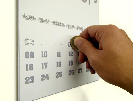
i quite like this and i think it is a cool spin on the traditional calendar. i think this calendar would appeal to children and adults alike.

this is another cool design and would be real interesting if it had inspirational quotes or an image underneath to reveal each day
here are some of the calendars that i found on http://bashooka.com/inspiration/creative-calendar-design-ideas-2013/

this calendar is quite cool and i like how it is interactive, though would require monthly set up

i really love the illustrations on this calendar though it has a pretty standard single page layout.

this calendar is pretty awesome with every day being on the on sheet it is a very interesting concept with the spirals.

this calendar makes me laugh with each of the months being illustrated by a silly holiday in that month, it is a cool concept and brings attention to those funny little holidays that are often unknown.

this on cracks me up, suppose its better safe then sorry. this calendar is amazing and i feel that it would probably sell really well as a novelty gift.
these are all awesome calendars though the exercise has a set template to work from so i will work around the template for my design.

Retrieved from http://www.photocreate.com.au/images/marketing/hires_jpg/11.5x14_calendar_KidsMontage.jpg
i quite like this calendar how it is a few different images though it is quite plain and i don't think this is a style i would like to look into.
the following are a few cool designs that i found on http://walyou.com/creative-calendar-designs/

i quite like this and i think it is a cool spin on the traditional calendar. i think this calendar would appeal to children and adults alike.

this is another cool design and would be real interesting if it had inspirational quotes or an image underneath to reveal each day
here are some of the calendars that i found on http://bashooka.com/inspiration/creative-calendar-design-ideas-2013/

this calendar is quite cool and i like how it is interactive, though would require monthly set up

i really love the illustrations on this calendar though it has a pretty standard single page layout.

this calendar is pretty awesome with every day being on the on sheet it is a very interesting concept with the spirals.

this calendar makes me laugh with each of the months being illustrated by a silly holiday in that month, it is a cool concept and brings attention to those funny little holidays that are often unknown.

this on cracks me up, suppose its better safe then sorry. this calendar is amazing and i feel that it would probably sell really well as a novelty gift.
these are all awesome calendars though the exercise has a set template to work from so i will work around the template for my design.
Subscribe to:
Posts (Atom)


